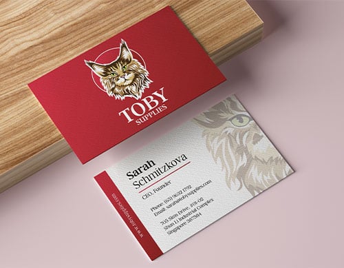
We created a few designs for our client to choose and they have decided to go with this layout. We use the same colour scheme from the logo, which is a gradient of reds. We suggested a spot varnish on the logo to make it reflective when viewing it at a certain angle. Together with matte lamination on both sides, it makes the logo on spot varnish stand out.


