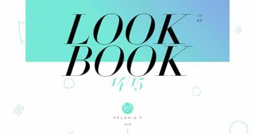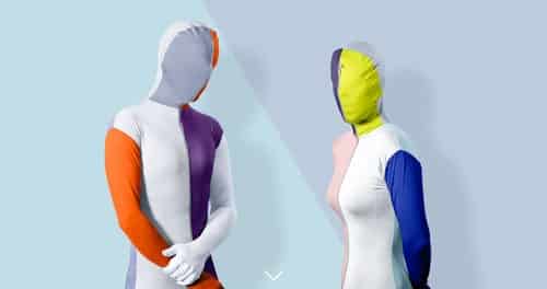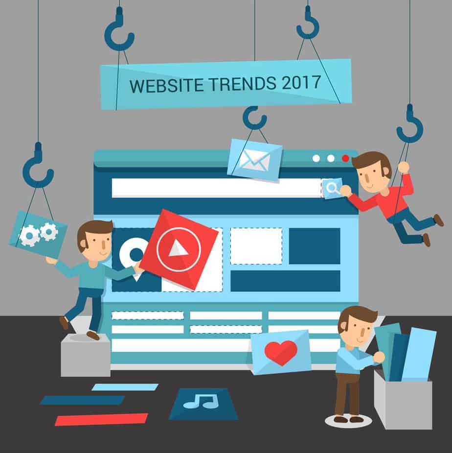
Humans are naturally attracted to visuals and graphics rather than plain words. So over the past few years, we have seen many popular websites are revamping to more visual-attracted sites to increase interactions.
1. Full-Width Slider
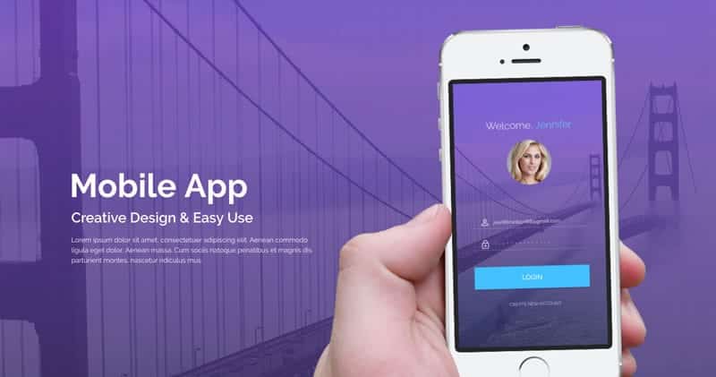
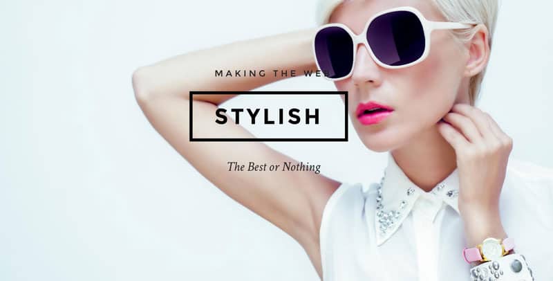
A full-width slider on your landing page gives a huge impact on a user when they first visit your website. This is the first thing they would see and it is crucial that your sales pitch is here to gain their attention to go on further, which may result in a conversion.
Information on the slider should be as short as possible as you do not want to feed your users with overloaded information on the first screen they see.
High-resolution images should also be used on the slider and throughout your website as it reflects highly on your business. It comes to show that you cared about your business and you want your user to feel that you always deliver high-quality products and services to them.
2. Masonry Layout
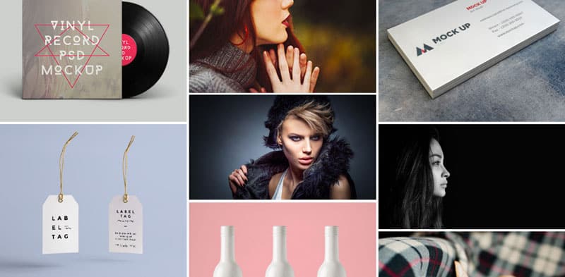
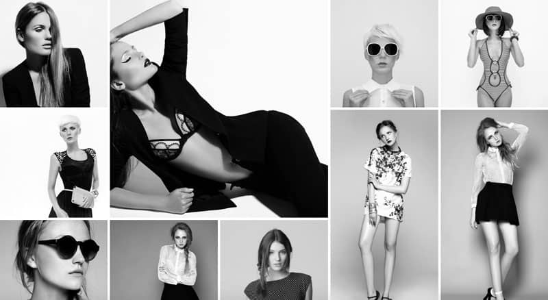
There are many ways to showcase your products and services over the past few years but the most popular trend in 2017 would be the masonry layout. It has the ability to adapt to any image dimension without cropping the original image, allowing you to show the full image without compromising on what is to be shown to the users.
3. Parallax Scrolling
Parallax scrolling effect wow us because it creates a smooth transition between sections of the same page when a user scrolls down, combining animation and smooth scrolling. This also creates interaction between the website and the user. Now that is a new way of showing content!
4. Web Colours
The fact is that there are no wrong colours in design. It all depends on how you use them and what combination is right for your website. Below is a video by Google Design on the best approach you can apply to get a recommended colour scheme for your entire website. Again, this is just a guide and do let your creativity run wild!

